
Trumpets heralded the news that thanks to Pantone, this year's #color of the year is Emerald Green. It's become a trendy color, mostly associated with contemporary designers like Jonathan Adler and Kelly Wearstler.
But even though it's a fresh popular color and we're surrounded with emerald green references (St. Patrick's Day, emerald as the gemstone for the month of May, the new film Oz the Great and Powerful), there are so many more fabulous shades of green in fashion and interiors.
Look at the variety of greens in this iconic fashion spread from Glamour in 1952.
 |
| Frances McLaughlin-Gill for the April 1952 issue of Glamour |
Reed Krakoff uses one of my favorite shades of green for Coach's Academy satchel. The fashion magazines are calling it leafy green.
 |
| Vogue February 2013 |


The leopard salt and paper shakers in a recent feature in Elle Decor are adorable. What shade of green do you think they are?
English and Australian designers seem to be loving green at this moment but the shades of green they like are mossy, like the Victoria & Albert goblet, from Mario Luca Giusti.

In the English home magazine Living Etc's February 2013 issue, a "pea green" bath from Epoca.

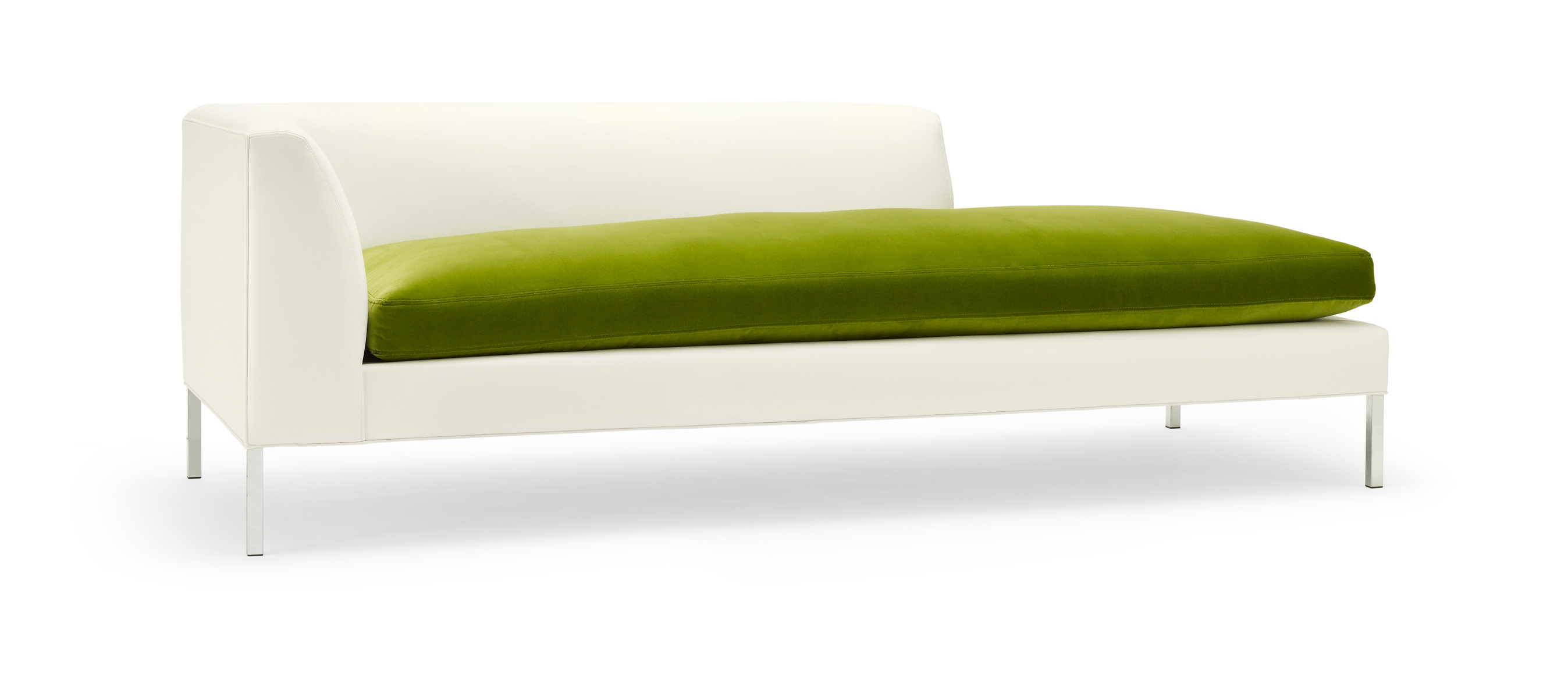
The Dylan daybed below that I designed several years ago is a mossy type of green, and so is my Louis rug, which is just below.

At the moment I'm liking kelly green. It's a great color mixed with black and white or neutrals, for color pop. Such a cute idea to frame black and white pictures with green, as seen in Living etc.'s April issue.

Kelly Wearstler is one of my favorite designers and coincidentally "kelly green" is one of my favorite colors. I love how Kelly uses green in a sophisticated way, how the color pop of a green element makes a space unpredictable. It's like how she mixes classical
elements with mid-century or contemporary. She is introducing something
unpredictable, like color, into
a space.


| Three images above are from Modern Glamour: The Art of Unexpected Style, by Kelly Wearstler (Regan Books, 2004) |
Kelly green is such a cheerful color, soothing yet vibrant and full of life. It can bring any interior palette to life. I have been using green for years and probably will for many more. One of my design projects from a few years back (pictured below) looks as fresh today as it was back then.

If you would like to utilize my interior design services to bring more color and life into your home, please contact me through the Pal + Smith website, where you can see a small sampling of the interiors we have created for clients as well as our boutique furniture collection.
Hi Melissa~gorgeous images. Greens, Kelly Greens, Kelly Wearstler are some of my favorites as well. I was thrilled to hear Pantone went green this year.
ReplyDeleteThat day bed and rug you designed for Pal+Smith are fab~tres chic. I've included Pal+Smith in my blog roll and will post a link sometime soon. Welcome back to blogging!
Best, Heather
http://www.stylemindchic.blogspot.com
Thank you Heather!! Best, Melissa
ReplyDeleteLiving etc is British.
ReplyDelete