Thursday, April 25, 2013

Leather & Lace

Leather and lace, to me, are all about the masculine and feminine energies, and I love them both when it comes to fashion at home and fashion apparel.

When I see a picture I'm drawn to I immediately tear it out of a magazine or scan it from a book. Those pictures usually become catalysts for mood boards, like this picture of Marion Cotillard in the perfect lace dress. I love the vintage 1940s look this image exudes. 

Marion Cotillard in Vogue July 2010

The sofa she's sitting on reminds me of one that I designed based on a vintage piece. I like the channeling in the sofa back but you should only do that when planning to use a solid color fabric. I wanted to use an Osborne and Little damask with a lace pattern on my Harper sofa so I opted for a flat back to show off the lacy design.

Harper Sofa from Pal + Smith


Departures Magazine 

There is so much crossover in fabrics for fashion and for upholstery. I'm dying to use this lace Lacroix fabric that Designers Guild launched during Maison and Objet in 2012.

Macarena by Christian Lacroix on Designers Guild


Kyle Bunting uses the same positive negative space of a lace pattern in his Butterfly hide rug. 

Butterfly Rug by Kyle Bunting


Leather can give an interior a weightier, masculine feel. I like the woven leather stand of Bottega Veneta's first lighting collection introduced last year. At Bottega Veneta, 877-362-1715.

Departures Magazine
Desk Lamp from Bottega Veneta at Da Vinci Home

Kyle Bunting once again champions the male aesthetic in his amazing collections of leather rugs, pillows and upholstery. This pillow is fun and trendy. It's design by Geoffrey Bradfield.

 Louis in Extremis by Geoffrey Bradfield for Kyle Bunting

This is such a pretty room. Though on first look the room has a masculine vibe, the pattern in the rug reminds me of lace and the coffee table is delicate. It's definitely got both yin and yang -- and a lot of style. LOOK!

Kyle Bunting Interior


Next week, you'll get my view on animal prints!

Friday, April 12, 2013

Flower Power


Floral motifs have always been a favorite of mine in design, and they are really a trend in fashion this year. These Dior ads are particularly eye-catching.

Christian Dior, Spring Summer 2013

Christian Dior, Spring Summer 2013

A traditional designer whose sense of color I relate to, Katie Ridder, puts the flowers on the walls rather than in the upholstery. I like that the seating and even the rug is all solid colors. The decoration is in the wallpaper.

Katie Ridder Rooms by Heather Smith MacIsaac

This classic De Gournay wallpaper with birds on branches looks like a painting.

Luxe magazine, Winter 2013

I adore Designers Guild. The coloration is perfect. I'm a Southern California girl, and it's interesting that one of my favorite colorists, Tricia Guild, is British. 

 Pandora Peony cushion from Designers Guild

Tricia Guild's exaggerated sense of scale is so dramatic.

Pavonia Cobalt Cushion from Designers Guild


Here's a pillow I designed using Osborne & Little fabric with a floral design in the same large scale.
Akemi Decorative Pillow from Pal + Smith


Stylized floral patterns usually are what I gravitate to, but this traditional Designers Guild wallcovering really caught my eye. I love it with the black background just as much as the white, which usually is my preference.


Rugosa Garden wallcovering from Designers Guild


Rugosa Garden wallcovering from Designers Guild


Rugosa Large Scented Candle from Designers Guild

So you get that I like floral patterns that are larger than life? Well, look at this rug I designed. The flowers and leaves look big, right? Now look at the picture below it of the room where I placed the rug, and you can see how huge the flowers are. Pretty dramatic!

Azore rug from Pal + Smith

Pal + Smith interior design of a living room, with Azore rug, Akemi table, Shoji floor lamps and Chelsea sofa designed by Pal + Smith creative director Melissa Palazzo

If you would like to utilize my interior design services to bring more color and life into your home, please contact me through the Pal + Smith website, where you can see a small sampling of the interiors we have created for clients as well as our boutique furniture collection.


Tuesday, April 2, 2013

Coral: The New Red


Coral is a great alternative to red. Although it is not necessarily a spring color it reminds me of Spring/Summer. It looks great with black and white or even charcoal. I like how Jamie Drake used it in this bedroom. The coral gives the serene palette a punch of color.


Architectural Digest, April 2013, Jamie Drake

Hutton Wilkinson's quote in the latest House Beautiful is perfect: "Coral is my idea of beige." 


But while Hutton Wilkinson might do entire rooms in coral, like the one above, I like using coral as a strong accent, like how Katie Ridder designed the frame of this staircase. Gorgeous!

From the book Katie Ridder Rooms (Vendome, Nov. 2011)


Baker Furniture's Marsan Chair from The Tony Duquette Collection

It is typical to associate coral with the beach, but I see it being used in a more sophisticated way. I love it on furniture and on doors (the wallpaper and door below are by Katie Ridder).


Coral pairs so beautifully with charcoal, doesn't it? The combination and the texture in this Mokum fabric is so appealing.

Mokum fabric Mauritius 121 Coral


We used this coral Cirque lantern from Urban Electric in a modern beach home.

Coral birdhouse, House Beautiful, April 2013


Stut X-Large Table from Blu Dot


I would use coral in every project if I could. There is so much product available in coral.

If you would like to utilize my interior design services to bring more color and life into your home, please contact me through the Pal + Smith website, where you can see a small sampling of the interiors we have created for clients as well as our boutique furniture collection.


Sunday, March 24, 2013

My Favorite Kelly Green


Trumpets heralded the news that thanks to Pantone, this year's #color of the year is Emerald Green. It's become a trendy color, mostly associated with contemporary designers like Jonathan Adler and Kelly Wearstler. 

But even though it's a fresh popular color and we're surrounded with emerald green references (St. Patrick's Day, emerald as the gemstone for the month of May, the new film Oz the Great and Powerful), there are so many more fabulous shades of green in fashion and interiors. 

Look at the variety of greens in this iconic fashion spread from Glamour in 1952.

 Frances McLaughlin-Gill for the April 1952 issue of Glamour
                     
Reed Krakoff uses one of my favorite shades of green for Coach's Academy satchel. The fashion magazines are calling it leafy green. 

Vogue February 2013


I'm seeing green items, traditional and contemporary, in all of the magazines. This Samuel & Sons trim would liven up pillows or curtains. 


The leopard salt and paper shakers in a recent feature in Elle Decor are adorable. What shade of green do you think they are? 

English and Australian designers seem to be loving green at this moment but the shades of green they like are mossy, like the Victoria & Albert goblet, from Mario Luca Giusti 

In the English home magazine Living Etc's February 2013 issue, a "pea green" bath from Epoca. 


The Dylan daybed below that I designed several years ago is a mossy type of green, and so is my Louis rug, which is just below


At the moment I'm liking kelly green. It's a great color mixed with black and white or neutrals, for color pop. Such a cute idea to frame black and white pictures with green, as seen in Living etc.'s April issue. 

                                   
Kelly Wearstler is one of my favorite designers and coincidentally "kelly green" is one of my favorite colors. I love how Kelly uses green in a sophisticated way, how the color pop of a green element makes a space unpredictable.  It's like how she mixes classical elements with mid-century or contemporary. She is introducing something unpredictable, like color, into a space.


Three images above are from
Modern Glamour: The Art of Unexpected Style, by Kelly Wearstler
(Regan Books, 2004)
   

Kelly green is such a cheerful color, soothing yet vibrant and full of life. It can bring any interior palette to life. I have been using green for years and probably will for many more. One of my design projects from a few years back (pictured below) looks as fresh today as it was back then. 


If you would like to utilize my interior design services to bring more color and life into your homeplease contact me through the Pal + Smith websitewhere you can see a small sampling of the interiors we have created for clients as well as our boutique furniture collection. 

Tuesday, March 19, 2013

Contest Winner!

Last week, we asked our wonderful Facebook followers to tell us where they would use this usual seating. The person with the most original idea would receive a fabulous interior design book from renowned blogger and author Holly Becker.


We've received amazing ideas from our fans and although it was a difficult task to pick the winner, we thought that there was one idea that stood out from the rest.

Congratulations, Angela Woodcock! We loved your idea of where you'd use this unusual chair:


"Outside in the garden for a Mad Hatter tea party with lots of flowers, garland and hanging vintage chandeliers."


You are the winner of the design book, Decorate by Holly Becker!


Thursday, March 14, 2013

Bowery Chic

I’ve had a lot of unique clients over the years. People in the surf and skate industry, musicians, a folk art collector, an automotive bigwig, corporate executive and his wife, athlete with a wife and kids, even a fashion designer … I design to my client’s wishes, personalities and moods. Every once in a while I will think up an “imaginary client,” like I did when I saw this picture.  

Vogue, February 2013

Let me introduce my Bowery Couple, referencing the neighborhood in New York where artists, actors and musicians have been living since the early 20th century.  A few buildings in the area go back 300+ years so my clients would live in a rustic apartment, like the one pictured below.  I love the look of this space, old wood beams and posts, white plaster walls.


Living etc. February 2013

But I wouldn't want everything in the flat to look ratty tatty. I like to mix things up and add a level of sophistication to the furnishings. His velvet jacket points up the look I'm after, and this tufted velvet rolled back chair from George Smith nails it. 


This is the living room I would create for the Bowery Couple. It speaks to the contrast of taking a refined piece of furniture and putting it in a deconstructed urban environment. It's a European thing.  

   
From "New Paris Style" by Richard Powers  

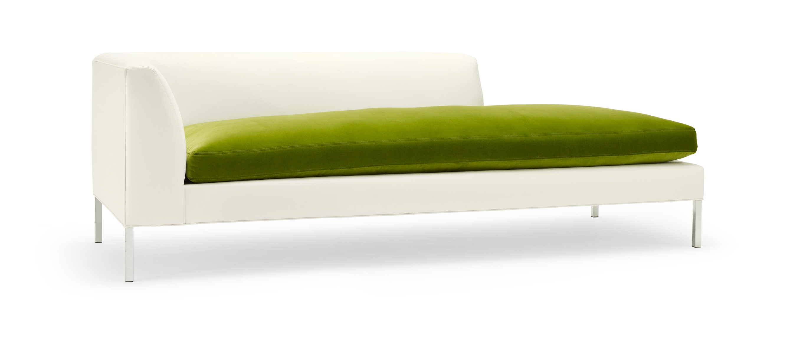
The velvet St. Germaine sofas, designed by Florence Baudoux, are a lot like my Chelsea sofa, below.  


I like layering a variety of textures in an interior, and I think the juxtaposition of this red lacquer cocktail table (below) by British designer John Reeves against the beaten and distressed background of a centuries-old flat would be amazing. This table also would look great with the Chelsea sofa.
Sketch cocktail table by John Reeves at ABC Buttercup


The March 2013 issue of Elle Decor seemed to have the right sort of furniture, lighting and accessories for my Bowery Couple. The earthy shades of these 3 Heavy pendant fixtures by Benjamin Hubert would go nicely with the "bowery chic" aesthetic. But I also love the light bulb by Lee Broom for Cafe Culture (bottom). It's cool because it combines contemporary urban design with traditional cut glass. I could see it hanging above an island. 


This chair is wild. Bowery Couple would want to have a pair somewhere in the flat.

Dreyfuss chair by David Weeks for Ralph Pucci International


The myriad textures in this table, between the cerused walnut top and base and hammered cast bronze pedestal, would make it a perfect candidate as a dining table for the Bowery Couple.  I spotted a chair on ElleDecor.com from Soane in London that might be a good accompaniment. These hand-blown cut-crystal glasses from Varga are the epitome of "bowery chic."
Balzac dining table by Robert Marinelli
featured in Elle Decor, March 2013


Opera Chair from Soane, London


Imperial Collection from Varga
                                       
I wasn't thinking about a rug for the imaginary flat for my imaginary Bowery Couple clients, but the Hummingbird came to mind and it is so perfect for the living room. Look at the purple, lilac, red and gold against the dark ground. While many designers create a room around a rug, in this case the rug came after I designed the room in my mind. It's kind of like the chicken, or in this case, bird and egg. Which comes first? It doesn't matter, as long as the result is exceptional. 

Hummingbird by Alexander McQueen at The Rug Company